Written Madrid es un proyecto que quiere preservar la identidad gráfica de la ciudad de Madrid. Nos pidieron escoger un rótulo de un establecimiento antiguo de la ciudad y diseñar una versión digital de su tipografía.
El objetivo es crear una base de datos con todas las tipografías generadas para que cuando un emprendedor inicie un negocio en el centro histórico, puedan escoger una tipografía respetuosa con el ambiente y la historia de su localización.
This project’s aim is to preserve Madrid’s graphic identity. We were asked to choose a sign from an old establishment in Madrid and design a typeface out of the letters that were in it.
The main idea of this project is to create a database with all of our designs so when an entrepreneur decides to start a business in the historical centre of Madrid, they can choose a respectful typeface according to the environment and history of its location.

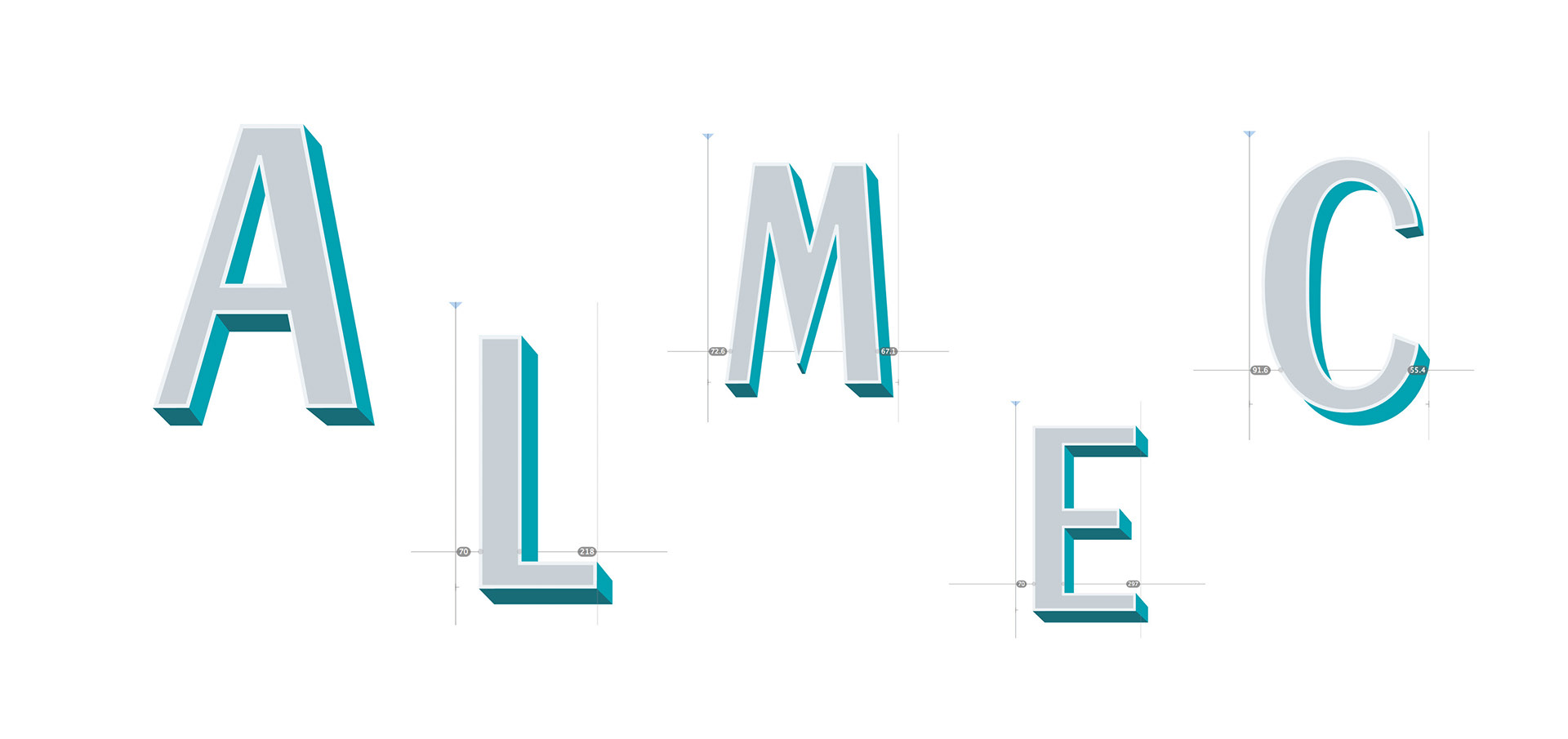
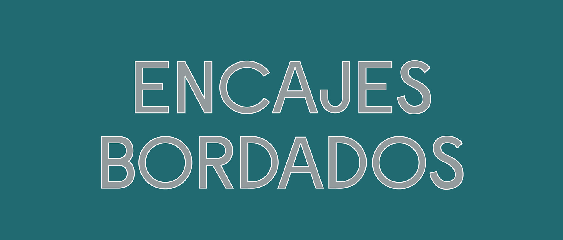
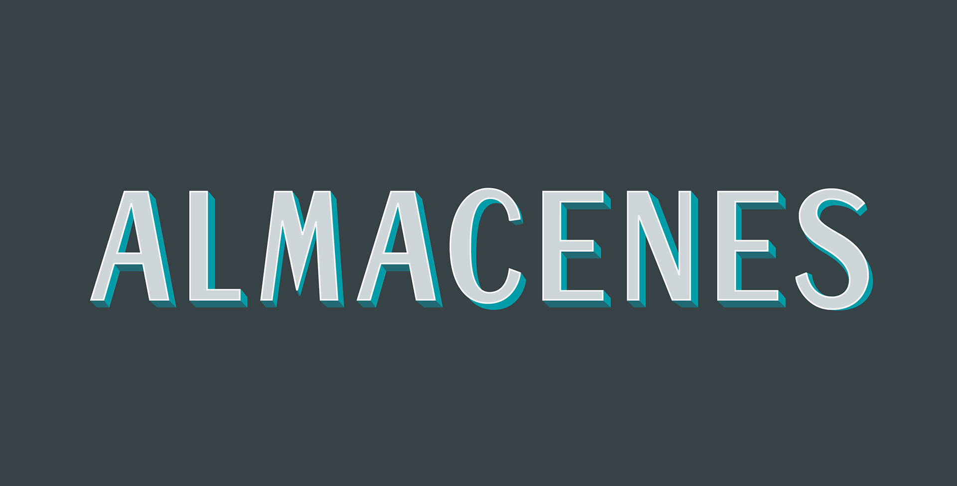
I chose to design the sign of a traditional notions store in the city centre. As the sign has two typefaces, I decided to create a system in which you can combine the two of them to create a variety of graphic solutions.
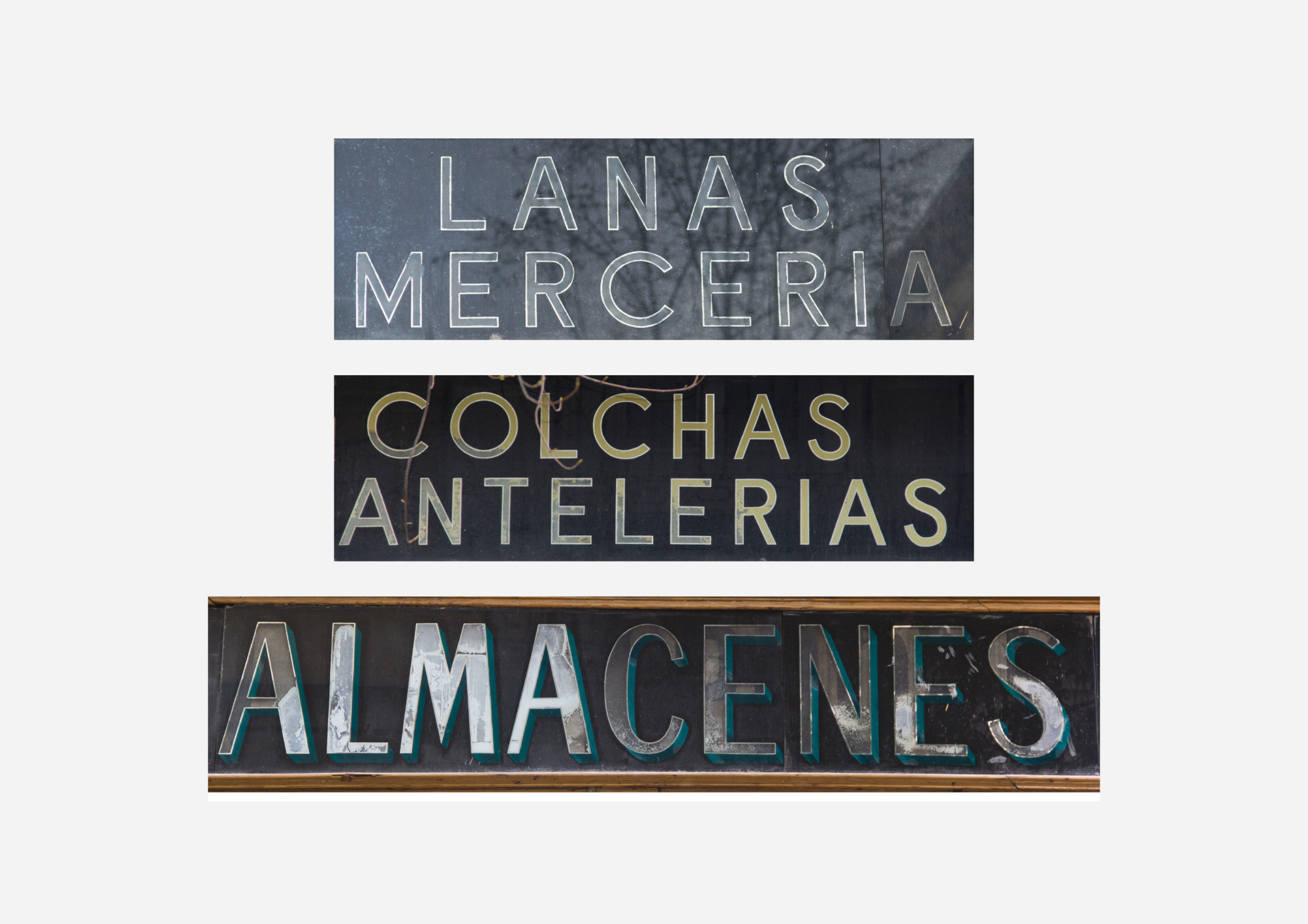

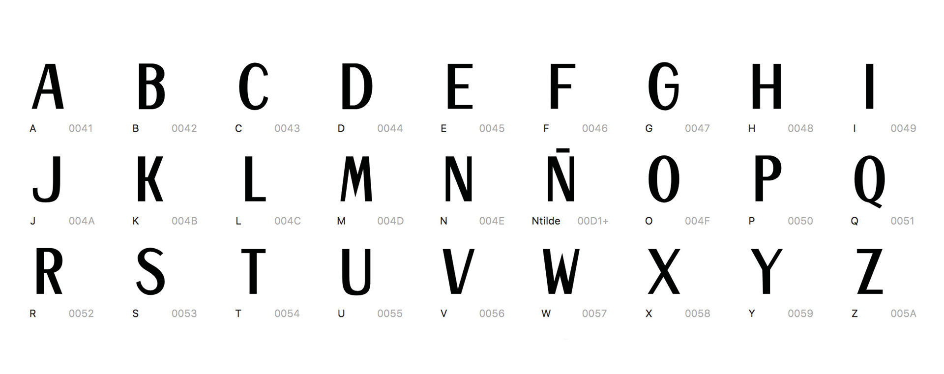
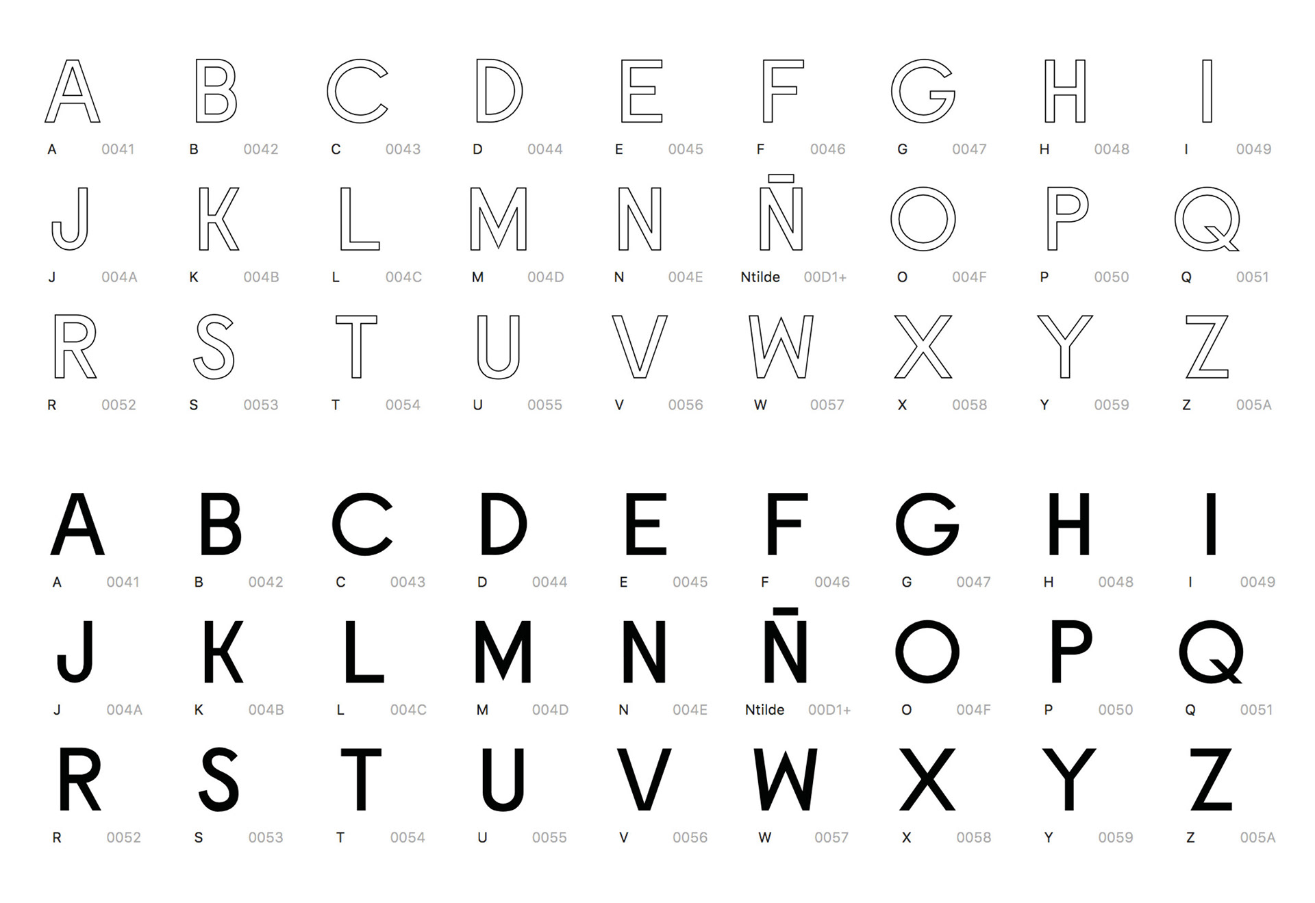
In addition, as one of the most beautiful details of the sign was the relief of the letters, painted in glass, I wanted to include that in my design. Therefore, I created a layered font in glyphs so you can give some volume to the letters if you want to.